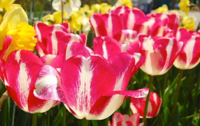
Hot pink peppermint striped tulips with golden daffodils at the Toronto Botanical Garden, 2010
Let’s shake up this grey city with an blast of clashing colours. I’ll go on record here as saying I believe that nothing in nature clashes. She is always original and unabashed in her colour pairings. Designers, however, use clashing colours with a purpose – it’s a wake-up call, vibrating with energy.
If you are unsure whether certain colours clash, there’s colour theory for that – clash is pairing a colour with another to the left or right of its complement on the colour wheel. See this illustration over on ColorBay.com. This Friday Idea File contains a bouquet of clash. Tell us what you think.
And, no, I can’t resist a bad pun. Even the same bad pun. Maybe because I have a touch of brash.
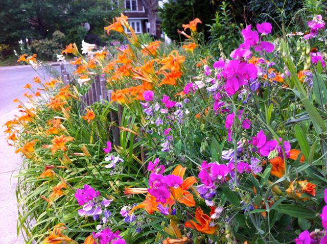
Magenta perennial sweetpea (Lathyrus latifolius) grabs attention against a mass of orange ditch lilies (Hemerocallis fulva)
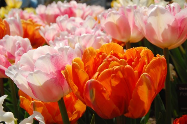
A gentle clash in a similar scheme. The pinks are a little less blue, and white tones it down, but the combo is still bold.
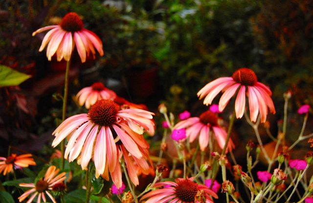
Here, the pink underlying the orange in the coneflower (Echinacea) echoes the magenta rose campion (Lychnis coronaria)
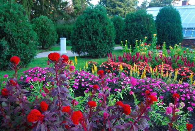
It’s go bold or go home in this paintbox bed of annuals at the Indy Museum of Art.
Even this pairing of orange, purple, hot pink and chartreuse “shouldn’t” work. But it does. Don’t you think?
Helen Battersby is a gardener, a writer, a garden speaker, and a power-walker, not always in that order!
8 comments
I love pink and orange, so I love that closeup of the tulips. That really bright magenta and orange, not so much. It hurts my eyes.
Alison, in that shot of the sweetpea and daylilies, you can just make out trumpet lilies in the distance. They actually combine those colours (or tones and hues of it) in the same flower!
You know what? I've stopped worrying about whether things clash or not–if I like it, it stays:) Somebody once told me I have a 'clown pants' garden…but I take that as a compliment!
Absolutely, Jan. You go for it!
Well they sure brightened my day anyway. Brilliant colors.
They fill they eye, don't they?
Bring it on!
Alice, can you tell that I'm champing at the bit for spring?