
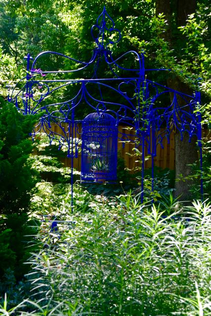
Since visiting the garden of Linda Hostetler in The Plains, Virginia, I’ve spent a long time trying to feel blue. I mean feel it – to understand the science behind why gardeners love this eye-popping blue called ultramarine (and sometimes Majorelle blue, after the painter and his garden).
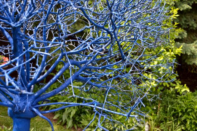
As my camera and I slowly explored Hostetler’s interesting front yard, a voice whispered, “If you haven’t seen the back garden yet, go!” Go, I did, and discovered a large, attractive garden alight with ultramarine. Everywhere. In other hands, so much colour might overwhelm – or even ultramarinate – the space. Judging by the reactions all around me, this single, strong accent created a lot of excitement. A sampling.
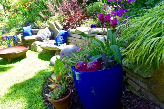
As you might guess from a couple of these pictures, the light at this time of day was not my friend. From the stone bench, Hostetler placed blue-painted arbors leading to walkways in many directions, each taking you past blue treasures among well-composed plantings.

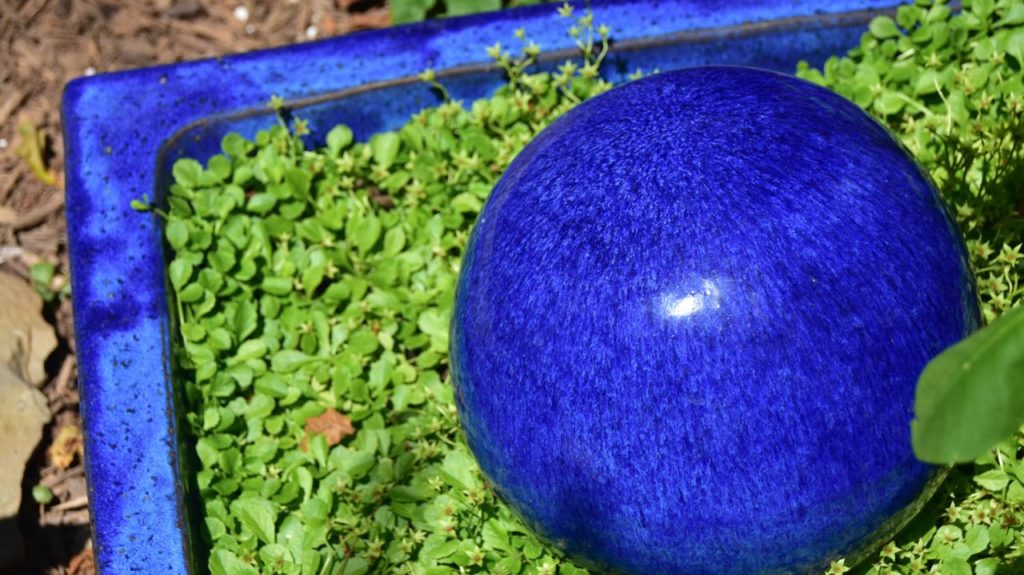
What makes this blue so appealing as a garden accent? When it came to life as a pigment, 6,000 years ago, ultramarine was rare and costly, ground from semi-precious lapis lazuli stone. But the birth of industrial chemistry in the 1800s led to inexpensive synthetics, so cost no longer signifies its value. Yet, it pops up over and over.
Ultramarine sits, with green, on the “cool” side of the colour wheel. Used together, they create an analogous colour scheme. In theory, this should be harmonious and restful. Hot colours advance and stimulate, cool colours recede and calm, right? But theory and sensory experience differ here. This intense blue, hinting almost of purple, has pop and pull. Perhaps the paradox of a hot-cool colour gives it appeal. What do you think?
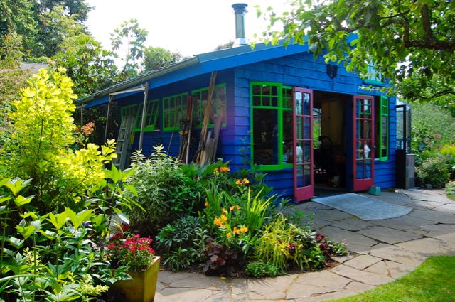
Hostetler’s wasn’t the only garden on the DC-region Garden Bloggers Fling to add ultramarine for a splash of drama.

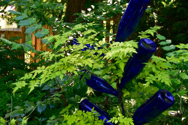
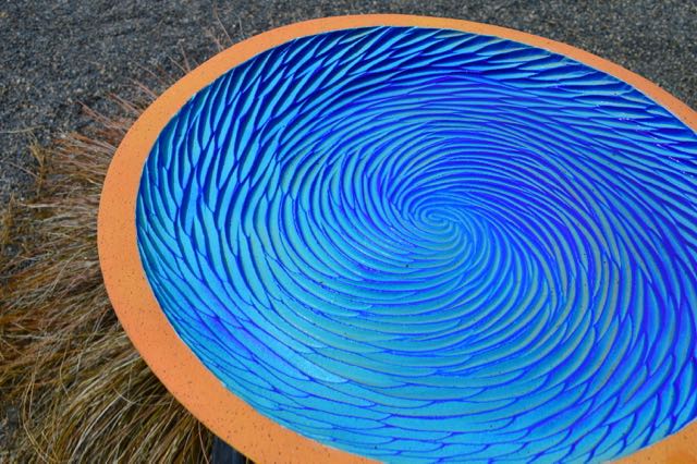
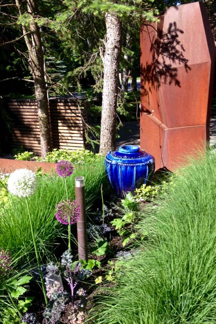
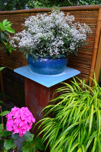
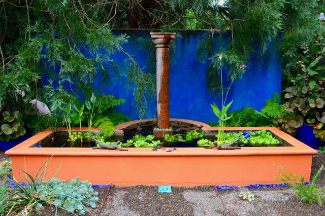
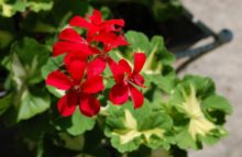
The objects below aren’t all “true blue.” Some live on the borderline tints, tones and shades of this vibrant hue. Sometimes ultramarine acts as an under-colour. In the second image below, it’s paired with the blue-green or green-blue I’ve learned has the delightfully over-consonanted (hey, I make words up for a living) phthalo green. This pleasing combo crops up in other examples, too.

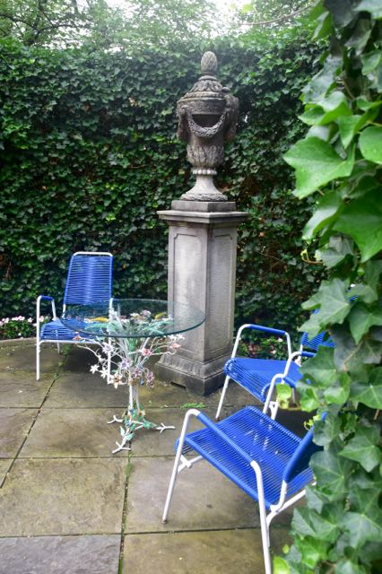
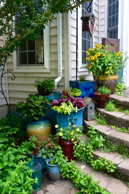
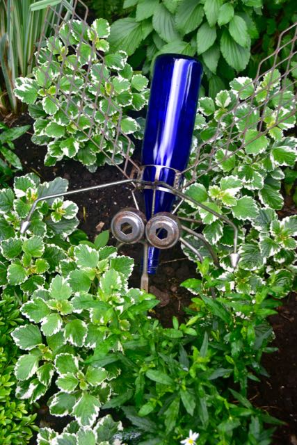
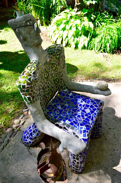
Above, from left: Blue-haired figure in Ellen Ash garden; Planter in Scott Brinitzer garden; Seating at Hillwood Estate; Potscape at Casa Mariposa; Bottle art in Barbara Katz garden.

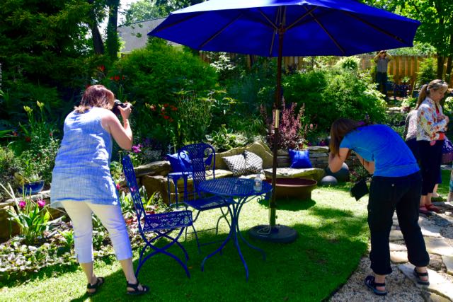
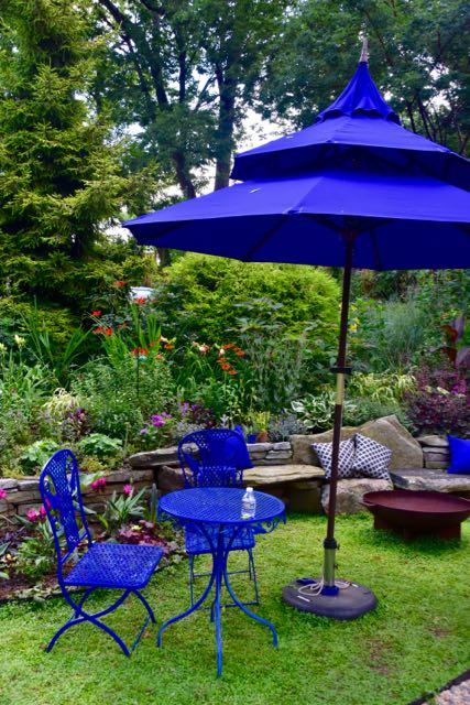
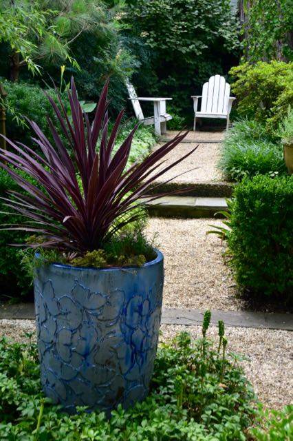
And a ramble through my photo files from Flings past uncovered a wealth of inspiring examples, including of course plants. Open the slideshow to view larger, sharper images by clicking any picture in this post.
What do you feel about ultramarine – has-been, too-little-seen, or in-between?


19 comments
Oh, I think it’s everywhere, including my own garden, but that doesn’t diminish my adoration for it in a garden. It just *works* so well with green leaves. I enjoyed your cobalt (for that’s how I think of it) photo sampling.
Yes, this colour – or close to it – is known by many names. Cobalt is another. I remember when I first saw it I had the urge to paint on anything that would stay still long enough. I’ve mellowed since.
This is one of those garden trends (not quite the right word…maybe stalwart is better?) that I can appreciate in others gardens but would never, could never, have in my own garden. The color is a but like nails on a chalkboard for me.
Having seen (and written about) your garden, I can appreciate that, Loree.
Love it! Although I did appreciate the “wow” factor of having that colour throughout the garden, I’m more of an understated type of gal in my own garden – one or two pops would do me.
I know what you mean, Margaret. Moderation in all things (though Julia Child would add: Including moderation).
The location of a garden is such a big factor when thinking about colour — light in different countries or regions varies so greatly and that affects how well a colour works. I remember people remarking that citrus and burgundy were combined a lot in gardens seen on the Toronto Fling. Maybe the combo was fashionable but I think people use it because it works in northern light conditions. I admire ultramarine/cobalt/Majorelle blue but the blue I prefer in my garden is softer, more like periwinkle.
That’s an excellent point, Pat, as I might expect from an artist. I don’t have anything that blue in my garden, though I did paint an obelisk a deep lilac a while back. It is a softer shade. I think even the blue-blues here (and I’ve written about them before) might be less intense. I’ll have to go back and look.
Having visited other countries, I know how Toronto light differs from, let’s say, the golden light of Venice. That’s why Mediterranean colours work there, but can look out of place in northern light like ours.
Thank you for the history and color theory. I have always liked the color of lapis lazuli and to wear jewelry made of it. I love bits of cobalt aka ultramarine in gardens. In Linda Hostetler garden I felt like it tied or connected the garden with repitition on a theme. It turned each piece that was blue into art! The accent of the fuschia shades in the flowers was a stunning counterpoint! This garden was a heady experience for me. One i will long remember! : )
There’s probably a reason that blue is the world’s favourite colour. Lapis lazuli is a gorgeous stone, though I don’t own any myself. I did once have a ring with a captive bit of deep-blue butterfly wing that was absolutely hypnotic.
Here, we call it cobalt, but I love your headline, and cobalt wouldn’t work as well. 😀 I love it for containers. In fact, all of my deck containers are that color, and my deck rug also has it in there. It’s like the sky, but intensified and works well with brilliant reds, oranges, pinks, etc. In a hot climate, those colors don’t fade. Thank you for this post. It’s made me think about the color and the garden. I loved her garden. ~~Dee
It was an exciting garden to see and to think about. The blue almost overshadowed her plant combinations and other aspects of the garden, both of which I was quite into before someone told me to get to the back, posthaste! Some of these other things might make it into another post.
Beautiful photos! You captured the blue wonderfully. I loved that garden!
Thank you, Laura!
Helen, enjoyed your thoughts and photos on this striking blue.
The blues have it in this garden. Beautiful.
It was impressive.
I agree with many of these comments; the blue you photographed is pretty strong for our GTA light. I do have a sculpture in my garden which I painted cobalt because it is far away and a lot of grass leads up to it. Behind the sculpture is a curved garden of orange day lillies.
Blue and orange make a great combo. Certainly, the amount of deep blue in this post would be overwhelming. But a single item, well used, could be just right.